thick fonts: A Bold Statement in Typography Design
Typography design is an essential element of graphic design. It plays a crucial role in communicating the message of the design to the audience. One of the most popular typography styles is thick fonts. Thick fonts are bold and impactful, making them effective in catching the viewer’s attention.

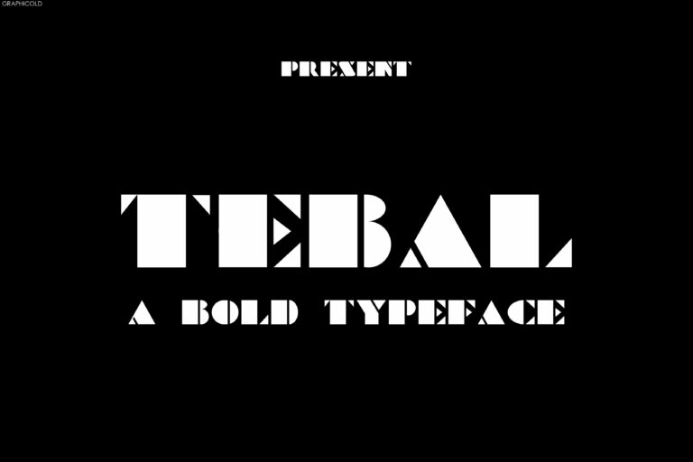
Thick fonts have been around for a long time, and their popularity has only grown over the years. They are often used in headlines, titles, logos, and other design elements that require a bold statement. Thick fonts are often created with a bold weight, making them appear thicker and bolder than other fonts.
The thickness of a font can have a significant impact on the overall design. Thick fonts can communicate strength, boldness, and importance. They can convey a sense of power, energy, and urgency. Thick fonts are often used in design projects that require a strong and impactful message.

There are many different styles of thick fonts. Some are more geometric and structured, while others are more organic and flowing. Some thick fonts have a hand-drawn feel, while others are more polished and refined. The style of the font you choose will depend on the message you want to convey and the overall design aesthetic you are going for.
One thing to keep in mind when using thick fonts is that they can be challenging to read in large blocks of text. Thick fonts are best used sparingly, in headlines or titles. When using thick fonts for body text, it is essential to make sure that the font is still legible and easy to read.

Thick fonts are a versatile and powerful tool in typography design. They can add impact and emphasis to design elements and help communicate a strong message. When used effectively, thick fonts can make a design stand out and leave a lasting impression on the viewer.


