punk fonts: A Brief History and Design Guide
Punk rock has been a cultural phenomenon since the 1970s, and its influence can still be felt in music, fashion, and graphic design. One of the most recognizable visual elements of punk is its unique typography, known as punk fonts. In this article, we’ll explore the history of punk fonts and provide a guide to using them in your designs.

History of Punk Fonts
Punk fonts emerged as a rebellion against the clean and polished typography of mainstream design. They were often created by hand, using techniques like cut and paste, photocopying, and letterpress printing. The DIY aesthetic of punk was reflected in the rough, jagged edges and distorted shapes of its typography.
The first punk fonts appeared in the late 1970s, coinciding with the rise of punk rock. Many of these early fonts were created by bands themselves, using whatever printing equipment they could get their hands on. Others were designed by independent artists and designers, who were drawn to the anarchic spirit of punk.
As the punk movement grew in popularity, so did its visual language. By the 1980s, punk fonts had become an established part of graphic design, appearing in everything from concert posters to album covers. Some of the most famous punk fonts of this era include Black Flag, Dead Kennedys, and Crass.
In the years since, punk fonts have continued to evolve and adapt to new styles and technologies. Today, they remain an important part of alternative and underground design, and are often used to evoke a sense of rebellion, subversion, and anti-establishment ethos.
Designing with Punk Fonts
If you’re interested in using punk fonts in your designs, there are a few key things to keep in mind. Here are some tips to help you get started:
1. Embrace imperfection. Punk fonts are all about rough edges, uneven spacing, and distorted shapes. Don’t be afraid to experiment with different techniques and tools to create a gritty, DIY look.
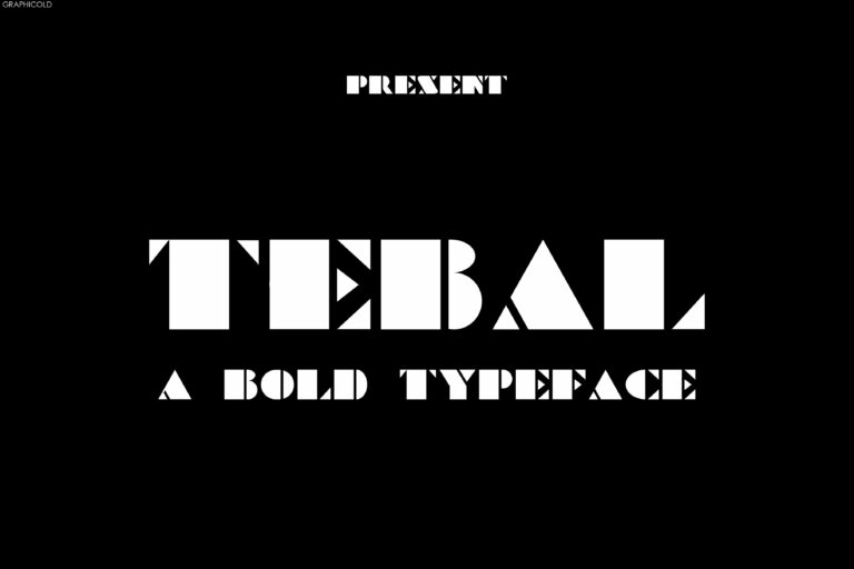
2. Play with contrast. Many punk fonts feature bold, thick strokes with sharp angles and corners. Use contrasting weights and sizes to create a dynamic visual hierarchy.
3. Keep it simple. Punk fonts work best when used sparingly. They can be overwhelming in large blocks of text, so use them for headlines, titles, and other important elements.
4. Experiment with color. Punk is all about breaking the rules, so don’t be afraid to use bold, bright colors or unexpected combinations. Just make sure your colors don’t clash with the overall tone of your design.
5. Be authentic. If you’re designing for a punk band or other punk-oriented project, authenticity is key. Use fonts that reflect the spirit and style of the punk movement, and avoid clichés or stereotypes.
Conclusion
Punk fonts have a rich history and a unique visual language that continues to inspire designers today. Whether you’re designing for a punk band, a zine, or just looking to add a rebellious edge to your work, punk fonts offer endless possibilities for creativity and self-expression. So go ahead, embrace the imperfections and let the punk spirit guide you!


