
death metal fonts: The Art of Brutality
Death metal fonts are a unique style of typography that is used to create a sense of brutality and aggression. These fonts are often associated with heavy metal and are used in album covers, posters, and other promotional materials.

The origins of death metal fonts can be traced back to the 1980s when heavy metal bands began experimenting with more extreme forms of music. As the music became more aggressive, the typography began to evolve as well.
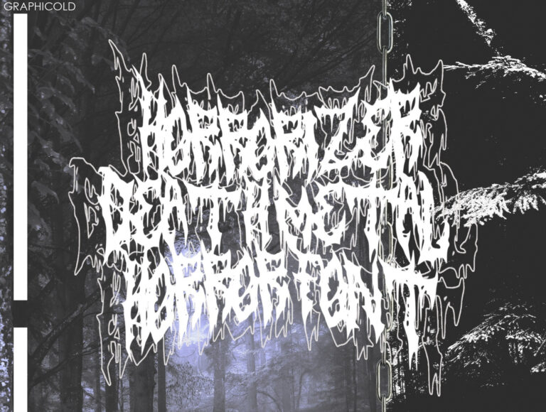
The most common features of death metal fonts are the jagged edges, sharp angles, and bold lines. These fonts are often created using a combination of letters and symbols, such as skulls, spikes, and other elements associated with death and violence.
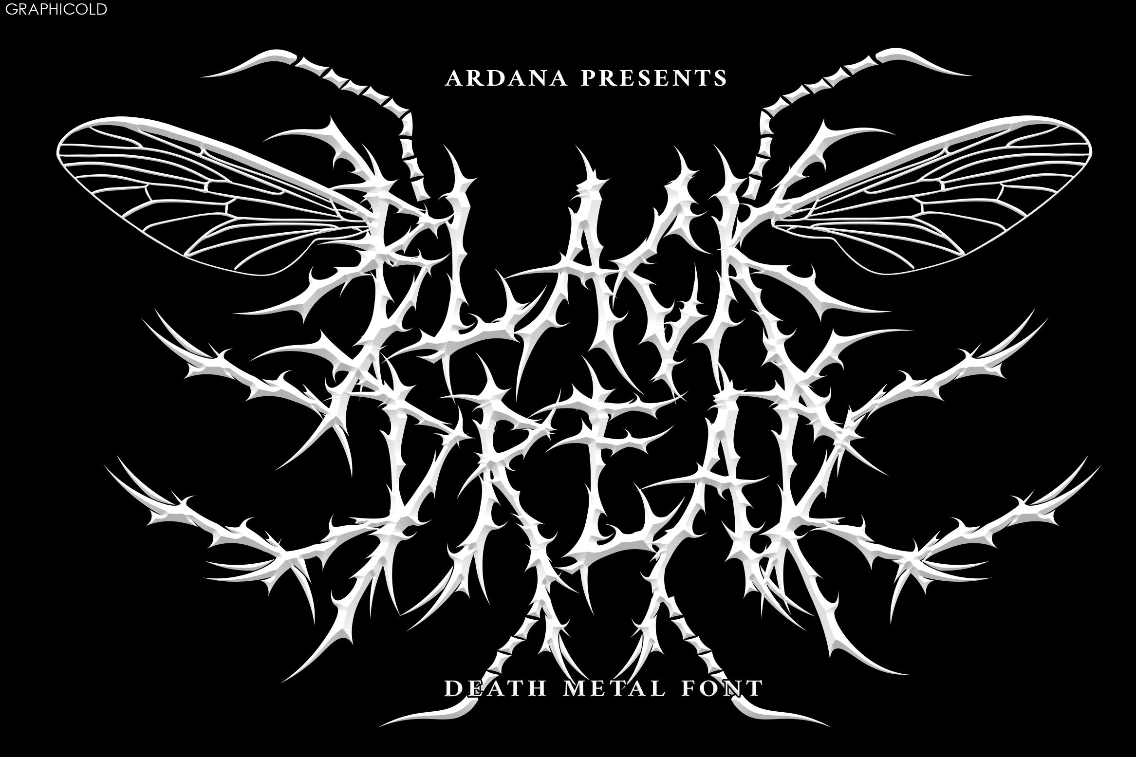
Another characteristic of death metal fonts is the use of dark colors, such as black, red, and dark grey. These colors are used to create a sense of darkness and dread, which is a common theme in death metal music.
Death metal fonts are not only used in music, but also in other forms of media, such as video games, movies, and television shows. They are often used to create a sense of tension and danger in these mediums.
Despite their association with violence and aggression, death metal fonts are also appreciated for their artistic value. Many graphic designers and artists use these fonts in their work, not only for their impact but also for their unique design elements.
In conclusion, death metal fonts are an integral part of the heavy metal culture. They are used to create a sense of brutality and aggression, which is a common theme in the music. However, these fonts are also appreciated for their artistic value and are used in a variety of media to create a sense of tension and danger.