Serif and Sans Serif: Understanding the Difference
In the world of typography, two key terms that often come up are serif and sans serif. These terms refer to the design style of typefaces and have a significant impact on the overall appearance and readability of text. Understanding the difference between serif and sans serif can help you make informed choices when selecting fonts for various design projects.

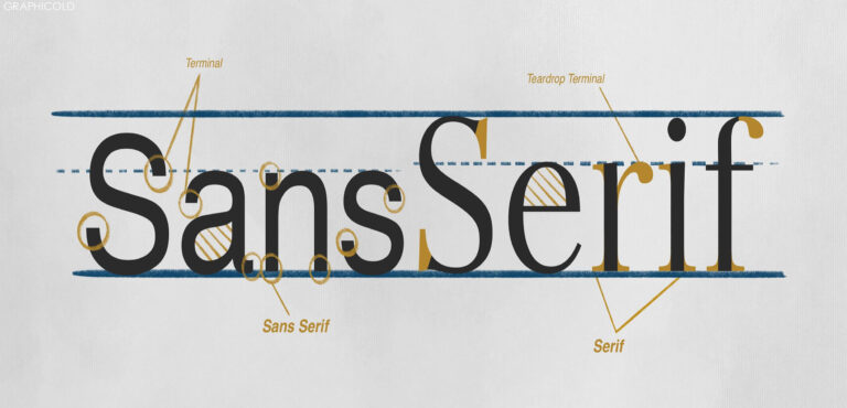
Serif typefaces, as the name suggests, have small decorative lines or strokes that extend from the main strokes of the characters. These horizontal or vertical lines are known as serifs. Common examples of serif typefaces include Times New Roman, Georgia, and Baskerville. Serif fonts are often perceived as traditional, elegant, and formal. They have a classic appeal and are commonly used in printed materials such as books, newspapers, and magazines.
On the other hand, sans serif typefaces do not have these decorative strokes. Sans is a French word that means without, so sans serif literally means without serifs. Examples of popular sans serif typefaces include Arial, Helvetica, and Verdana. Sans serif fonts are often considered modern, clean, and minimalistic in design. They are commonly used in digital applications, such as websites and user interfaces, as well as in large headings and signs.

One of the key differences between serif and sans serif typefaces is their readability. Serif fonts are generally considered easier to read in printed materials, as the serifs help guide the eye along the text. The serifs create a horizontal flow that aids in reading long passages of text. Sans serif fonts, on the other hand, are often preferred for digital applications, as they are believed to be more legible on screens. The absence of serifs allows for clearer letterforms, especially at smaller sizes.
Another distinction between serif and sans serif is their overall style and mood. Serif fonts are often associated with tradition, authority, and formality, making them suitable for conveying a sense of professionalism or seriousness. Sans serif fonts, on the other hand, are often perceived as modern, minimalistic, and friendly. They can evoke a sense of simplicity and approachability, making them suitable for contemporary and informal designs.
When choosing between serif and sans serif typefaces, it is important to consider the context and purpose of your design. Consider the medium in which the text will be presented, whether it’s printed or digital. Think about the mood and tone you want to convey and how the chosen typeface aligns with that. Ultimately, both serif and sans serif typefaces have their own unique characteristics and strengths, and the right choice depends on the specific requirements of your design project.
In conclusion, serif and sans serif are two distinct styles of typefaces. Serif fonts have decorative strokes known as serifs and are often used in traditional print materials. Sans serif fonts, on the other hand, do not have serifs and are commonly used in digital applications. Understanding the differences between serif and sans serif can help you make informed choices when it comes to selecting fonts for your designs.


