lato regular: A Versatile Typeface for Modern Design
When it comes to typography, finding the right typeface can make all the difference in conveying the desired message and aesthetic. Lato Regular is one such typeface that has gained recognition and popularity among designers for its versatility and modern appeal.

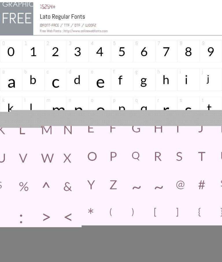
Created by Łukasz Dziedzic, Lato Regular is a sans-serif typeface that was first released in 2010. Its name, which means summer in Polish, reflects the warm and friendly nature of the font. Lato Regular combines geometric shapes with humanistic characteristics, resulting in a balanced and legible typeface suitable for various design applications.
One of the standout features of Lato Regular is its versatility. Whether it is used for print or digital media, this typeface adapts well to different sizes and resolutions without compromising readability. Its clean and simple letterforms make it a great choice for body text, ensuring easy and comfortable reading experiences for the audience.
The wide range of weights available in Lato Regular allows designers to use it for both headlines and body text, creating a unified and cohesive visual hierarchy. From the light and elegant Lato Hairline to the bold and impactful Lato Black, the font offers various options to suit different design needs. This flexibility makes Lato Regular a go-to choice for a wide array of design projects, including branding, editorial design, web design, and more.
Another key aspect of Lato Regular is its multicultural appeal. With support for over 100 languages, this typeface can be used globally, making it a valuable asset for designers working on international projects. It ensures that the typography remains consistent across different languages, maintaining the intended visual identity and message.
Lato Regular’s popularity is also due to its widespread availability. The font can be easily accessed and downloaded from various online platforms, making it accessible to both professional designers and aspiring creatives. Its open-source nature allows for customization and adaptation, giving designers the freedom to modify and experiment with the typeface to suit their specific design requirements.
In conclusion, Lato Regular is a versatile and modern typeface that has made its mark in the design world. With its balanced letterforms, extensive range of weights, and widespread availability, it has become a go-to choice for designers looking to create contemporary and visually appealing designs. Its adaptability and multicultural appeal further enhance its value, making Lato Regular an essential tool for designers seeking a reliable and aesthetically pleasing typeface.


