Discover The Perfect Balance Of Classic And Contemporary Typography
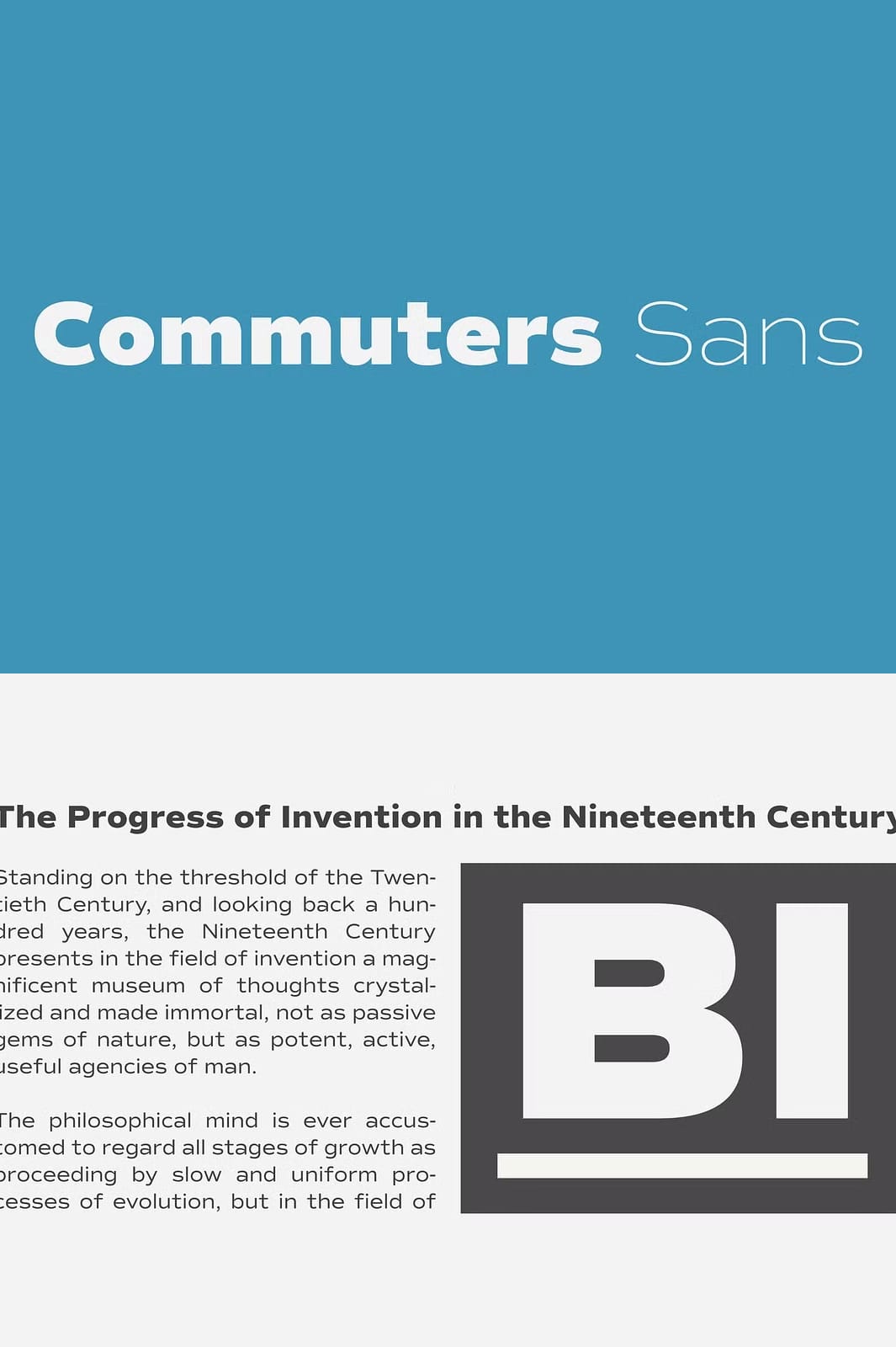
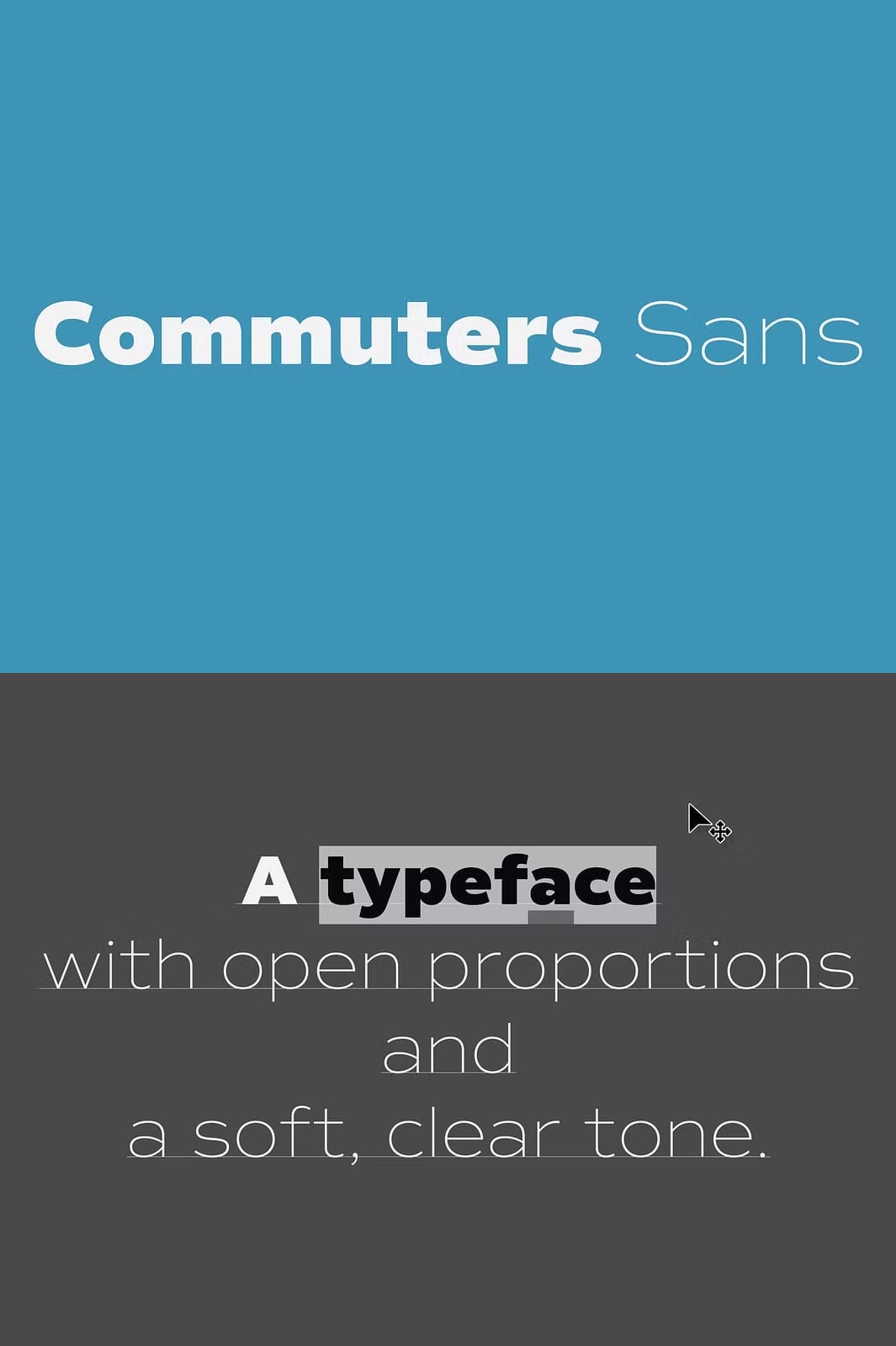
Commuters Sans emerges as the definitive daily-use sans-serif typeface, blending timeless elegance with contemporary clarity. This font family delivers exceptional versatility through its clean geometric forms and slightly wide proportions that enhance readability across various applications. Designers seeking a reliable yet distinctive type solution will appreciate its warm, approachable character that maintains professional polish. The font’s minimalist letterforms and carefully considered structure ensure outstanding performance in both display and text settings.
Experience Unmatched Versatility In Every Design Project
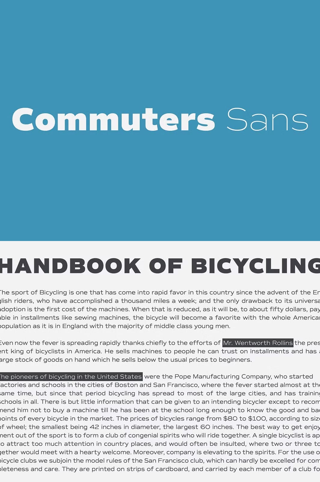
Whether creating bold headlines or extended body copy, Commuters Sans adapts seamlessly to diverse typographic needs. Its eye-catching structure commands attention in titling applications while remaining comfortable for prolonged reading in editorial contexts. The font’s balanced proportions and open counters provide excellent legibility at various sizes, making it equally effective in print and digital media. This adaptability makes Commuters Sans an indispensable tool for designers working across branding, packaging, and editorial projects.
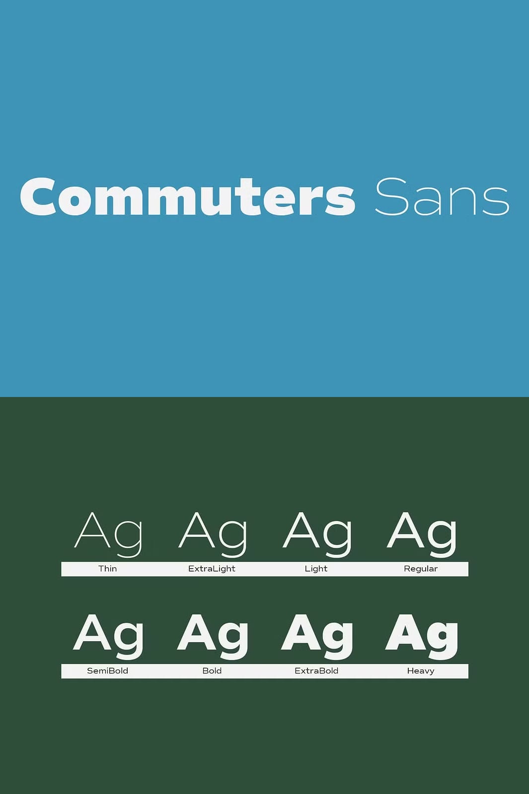
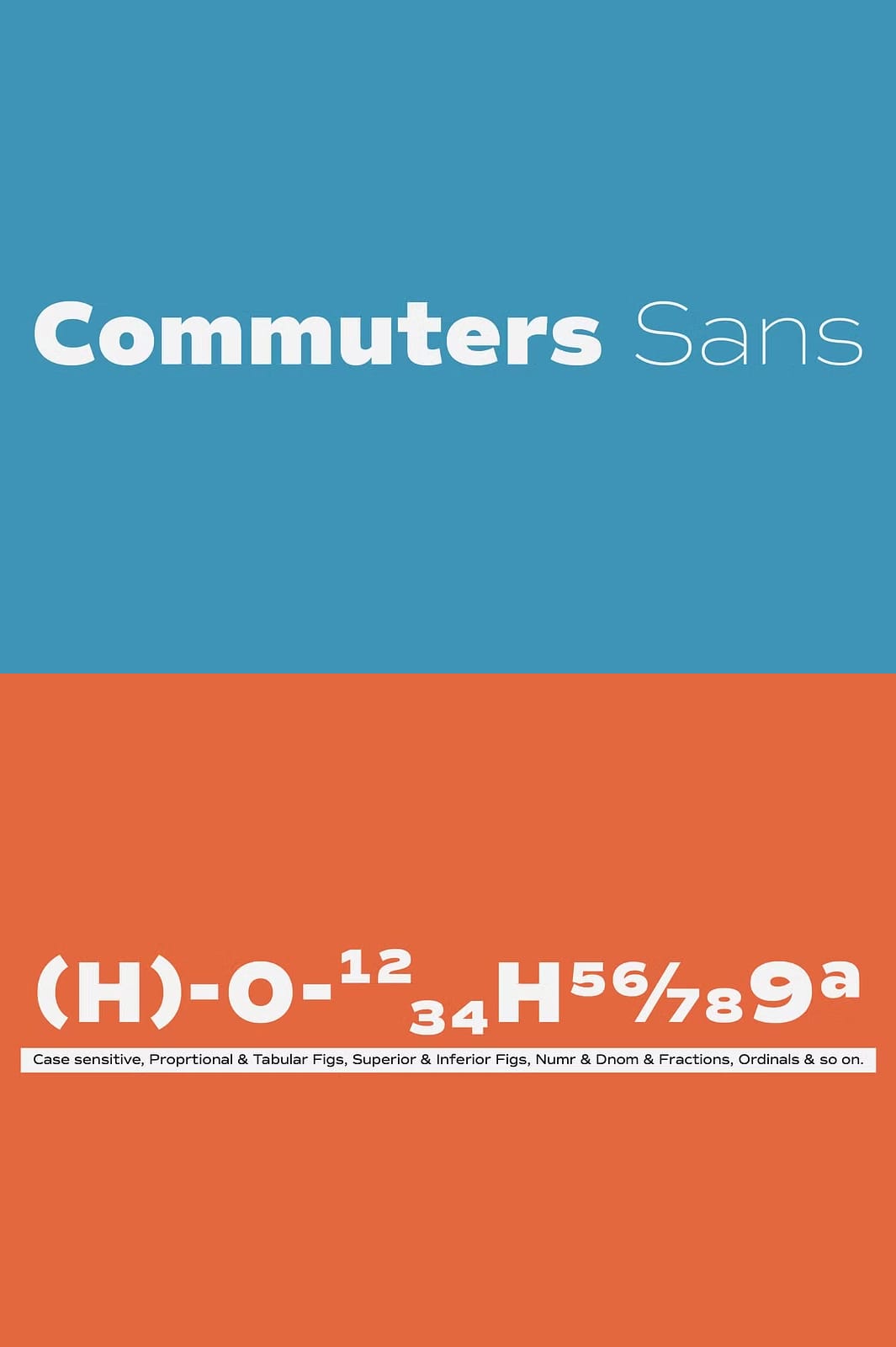
Comprehensive Font Family With Eight Weights And Italics
The complete Commuters Sans family includes eight meticulously crafted weights ranging from thin to black, each accompanied by matching italics. This extensive range empowers designers to establish clear visual hierarchies and create dynamic typographic compositions. The italics maintain the font’s essential character while adding movement and emphasis where needed. All weights share consistent proportions and design details, ensuring harmonious combinations throughout your projects.
Optimized For Professional Branding And Communication
Commuters Sans excels in corporate and editorial environments where clarity and personality must coexist. Its clean lines convey professionalism while subtle design nuances add warmth and approachability. The font supports nearly all Latin-based languages, making it ideal for global branding efforts. Use Commuters Sans to build trustworthy, confident brand identities that communicate clearly in any medium.
Perfect For Editorial, Branding, And Everyday Use
Commuters Sans performs excellently in various editorial settings, from magazines to digital publications. Its readability and visual appeal make it a prime choice for body text and headlines alike. Branding projects benefit from its balanced design, which adapts well to logos, packaging, and marketing materials. Its neutral yet distinctive style allows it to blend harmoniously with other design elements, enhancing overall aesthetics without overwhelming.
Effortless Integration Across Print And Digital Platforms
Designed with versatility in mind, Commuters Sans integrates smoothly into both print and screen environments. Its geometric simplicity and clarity ensure consistent rendering on different devices and mediums, preserving legibility regardless of scale. Whether you are designing websites, apps, posters, or corporate documents, Commuters Sans delivers reliable and polished typographic results.
Unlock Your Design Potential With Commuters Sans
Choosing Commuters Sans equips designers with a robust and flexible font family that supports creativity and clarity. Its broad weight options and italics empower nuanced typographic storytelling, while its warm tone fosters connection. Elevate your projects by incorporating this thoughtfully crafted font, ideal for everyday professional and creative use.