Key Features and Technical Specifications That Empower Creative Projects
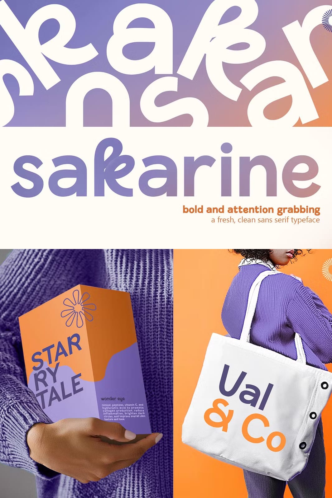
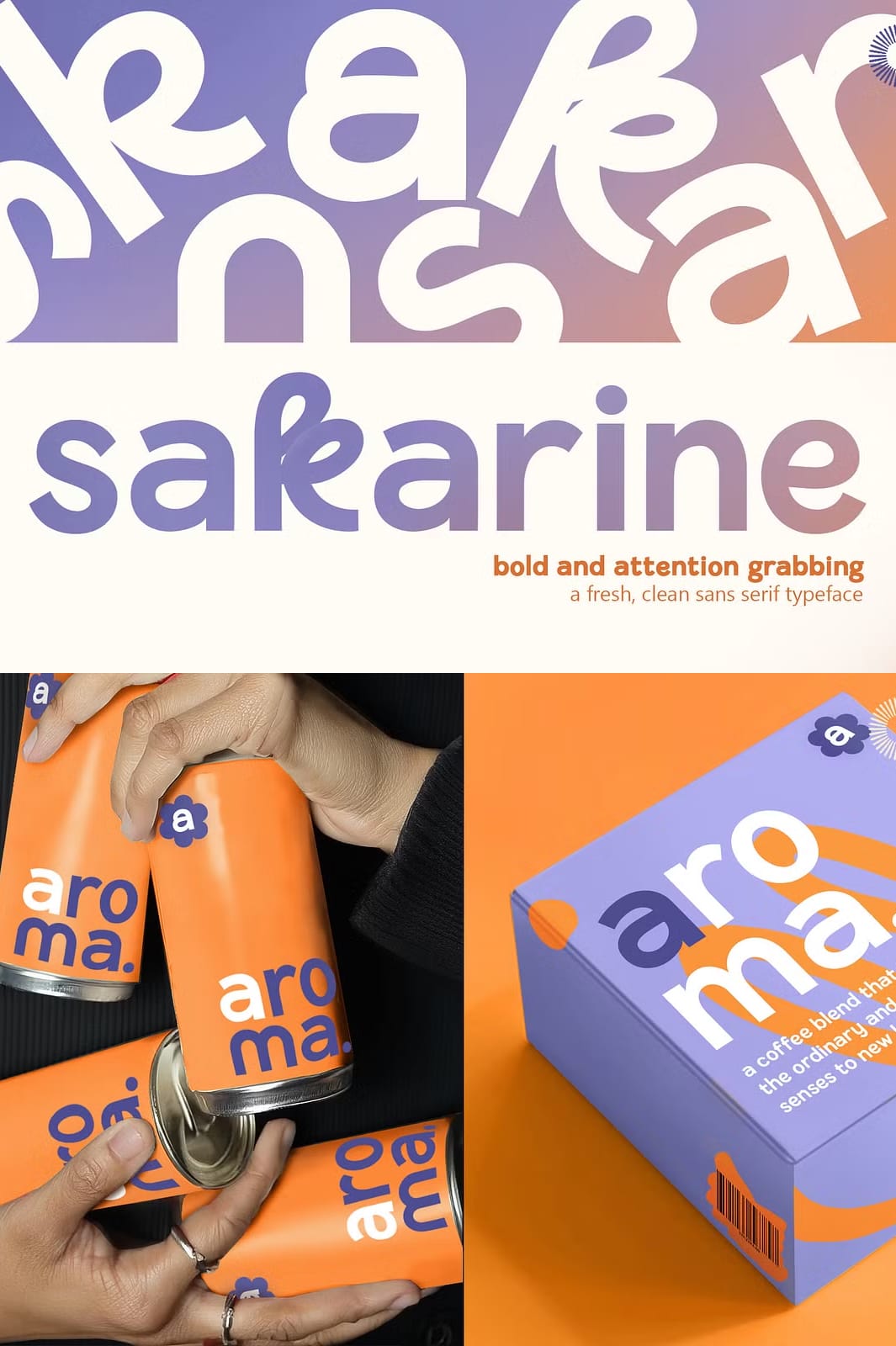
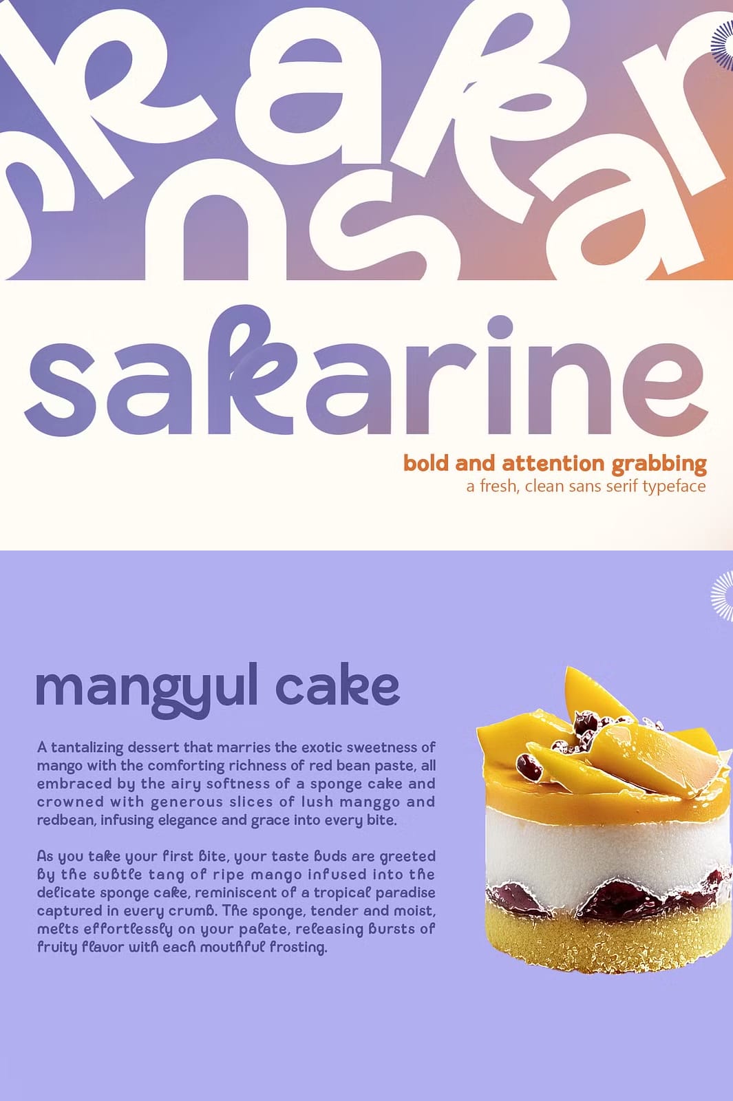
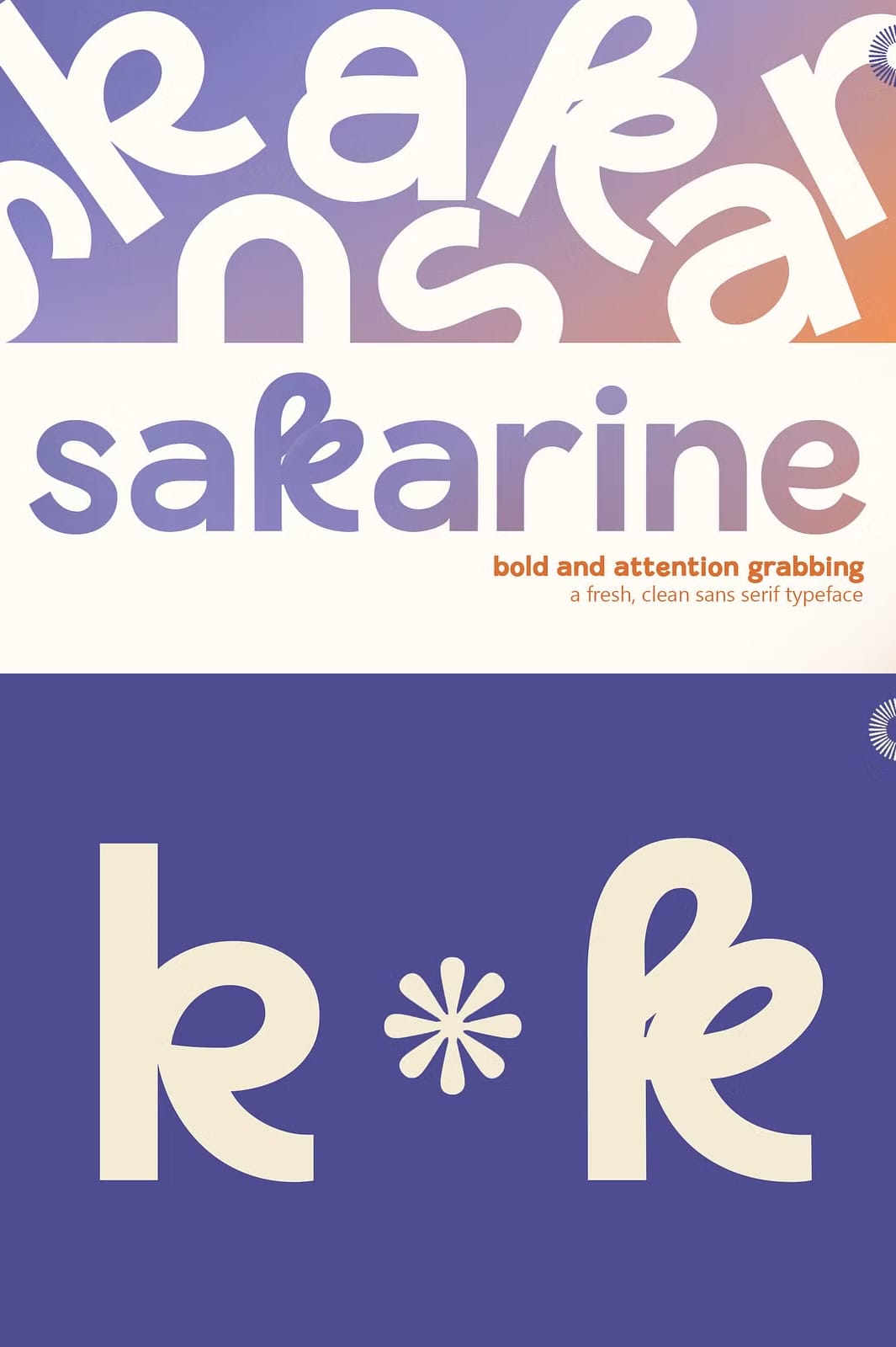
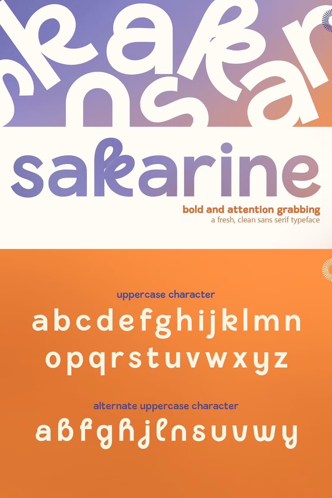
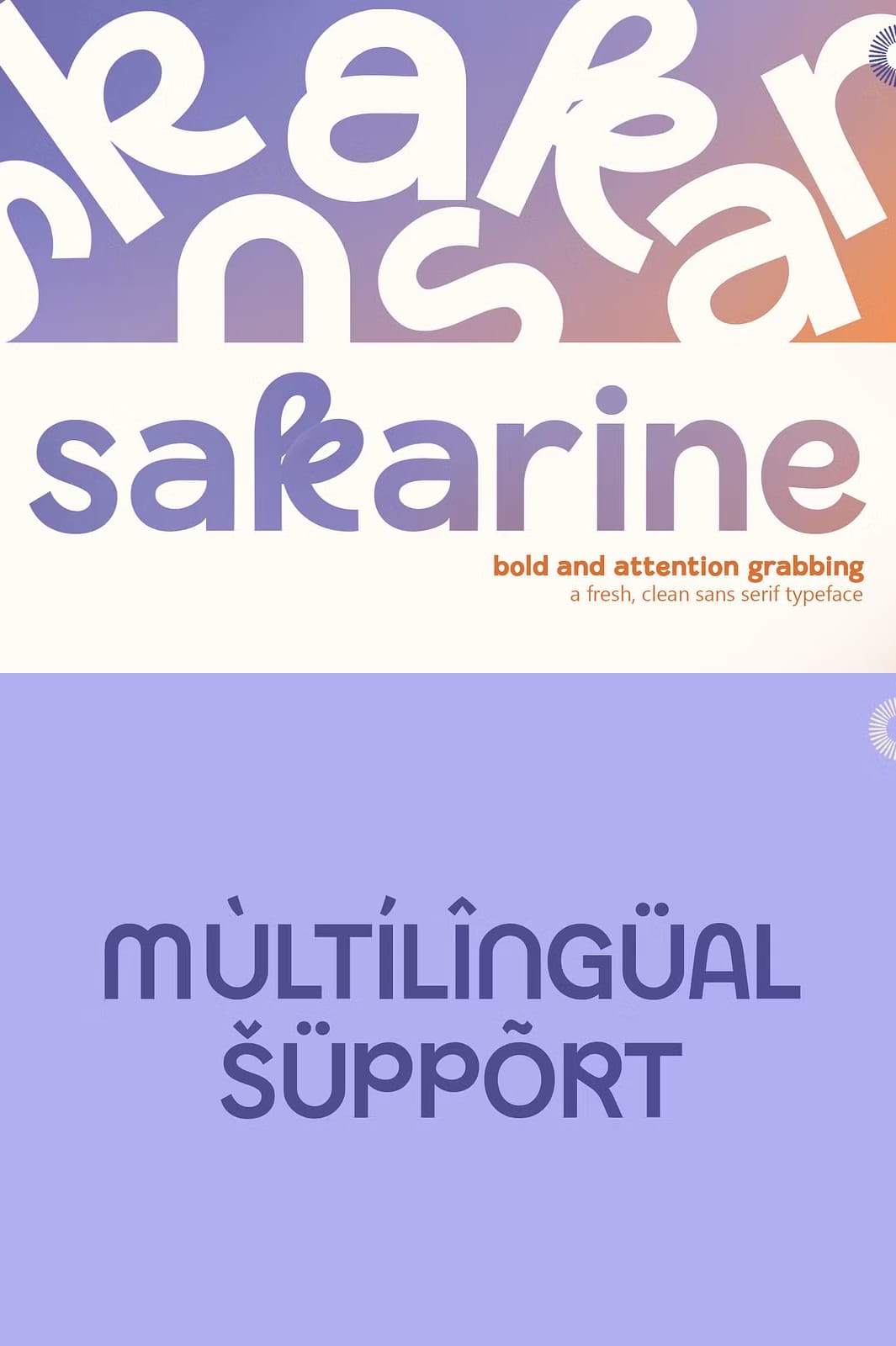
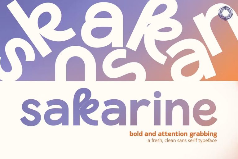
Sakarine delivers a crisp, contemporary aesthetic that elevates any visual communication. Designed in 2024 by the visionary Siela Mara for Setara Langit, this sans‑serif family balances readability with subtle personality. The collection includes nine distinct weights, each paired with a complementary italic style, providing a complete typographic system for headlines, body copy, and UI elements. All glyphs are meticulously kerned to ensure uniform spacing, while the open counters promote legibility on screen and in print.
Comprehensive Font Formats and Platform Compatibility Overview
The typeface ships in industry‑standard TrueType (TTF), OpenType (OTF), Scalable Vector Graphics (SVG), and Web‑Optimized Font (WOFF) formats. This multi‑format approach guarantees seamless installation on Windows, macOS, and Linux desktops, as well as effortless integration into web projects via @font‑face rules. Designers can also leverage the SVG version for crisp scaling in vector‑based applications such as Adobe Illustrator or Figma.
Creative Applications Where Sakarine Excels Across Digital and Print Media
- Brand Identity Systems – The clean strokes and balanced proportions make Sakarine ideal for logos, brand guidelines, and corporate collateral.
- Website Headers and Navigation – Variable weights allow designers to fine‑tune hierarchy without loading multiple files, improving page‑load performance.
- Print Editorial Layouts – High x‑height and generous line spacing ensure optimal readability in magazines, brochures, and books.
- User Interface Design – Clear legibility at small sizes supports UI labels, buttons, and form fields on mobile and desktop applications.
Installation Guide and Quick‑Start Tips for WordPress and Gutenberg Users
1. Upload the .woff2 and .ttf files to your theme’s /fonts/ directory.
2. Add the following CSS to your stylesheet to register the font family:
@font-face {
    font-family: 'Sakarine';
    src: url('fonts/Sakarine-Regular.woff2') format('woff2'),
         url('fonts/Sakarine-Regular.ttf') format('truetype');
    font-weight: 400;
    font-style: normal;
}
@font-face {
    font-family: 'Sakarine';
    src: url('fonts/Sakarine-Italic.woff2') format('woff2'),
         url('fonts/Sakarine-Italic.ttf') format('truetype');
    font-weight: 400;
    font-style: italic;
}
3. In Gutenberg, apply the custom CSS class sakarine-heading to any Heading block to instantly switch to the new typeface.
Best‑Practice Recommendations for Maximizing Visual Impact With Sakarine
Pair Sakarine with high‑contrast color palettes—dark backgrounds with light text or vice‑versa—to highlight its modern sleekness. Use the Bold or Black weights for primary calls‑to‑action, while the Light and Regular styles work well for body copy and supporting text. The italic styles add subtle emphasis without breaking visual harmony.
Download Sakarine – Immediate Access to Full Font Package
Obtain the complete Sakarine family—including all weights, italics, and format variations—by clicking the centered button below. The link redirects to the official Creative Market product page where you can purchase and download the assets.
For additional details, visit the product page on Creative Market: Sakarine – Sans Serif Typeface.