Harley-Davidson Font: Exuding Character and Style
Harley-Davidson, one of the most iconic motorcycle manufacturers in the world, is not just known for its powerful bikes and distinctive logo. Another element that sets Harley-Davidson apart is its unique and recognizable font, which has become synonymous with the brand’s rebellious and adventurous spirit.

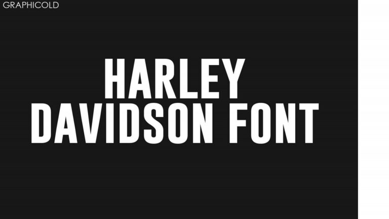
The Harley-Davidson font, known as Block Gothic RR Bold Condensed, is a bold and condensed typeface that reflects the brand’s rugged and strong image. The font features thick, heavy strokes and sharp angles, giving it a sense of power and solidity. This font is widely used in various Harley-Davidson branding materials, including advertisements, signage, and merchandise.
The choice of font for a brand is crucial as it helps in communicating its personality and values. In the case of Harley-Davidson, the font perfectly captures the essence of the brand. It conveys a sense of freedom, rebellion, and masculinity, which are all core attributes associated with the motorcycle culture.
The Harley-Davidson font is also versatile and adaptable, making it suitable for a range of applications. Whether it is used for headlines, slogans, or body text, the font maintains its impact and readability. It has a strong presence and can easily catch the attention of viewers, making it an effective tool for brand recognition.
The font’s bold and condensed design also allows for more efficient use of space, making it ideal for designs with limited room. This is especially important for motorcycle graphics, where every inch of space counts. The font’s compact nature ensures that the brand name and other details can be displayed prominently, even on small surfaces.
Over the years, the Harley-Davidson font has become an integral part of the brand’s identity. It has become instantly recognizable and is often associated with the spirit of adventure and the open road. The font has become a symbol of the motorcycle culture and has gained a dedicated following among enthusiasts and fans worldwide.
In conclusion, the Harley-Davidson font is more than just a typeface. It is a visual representation of the brand’s character and values. Its bold and condensed design exudes power and strength, making it a perfect fit for a brand like Harley-Davidson. The font’s versatility and recognizability have contributed to its widespread use and popularity among both fans and consumers.


