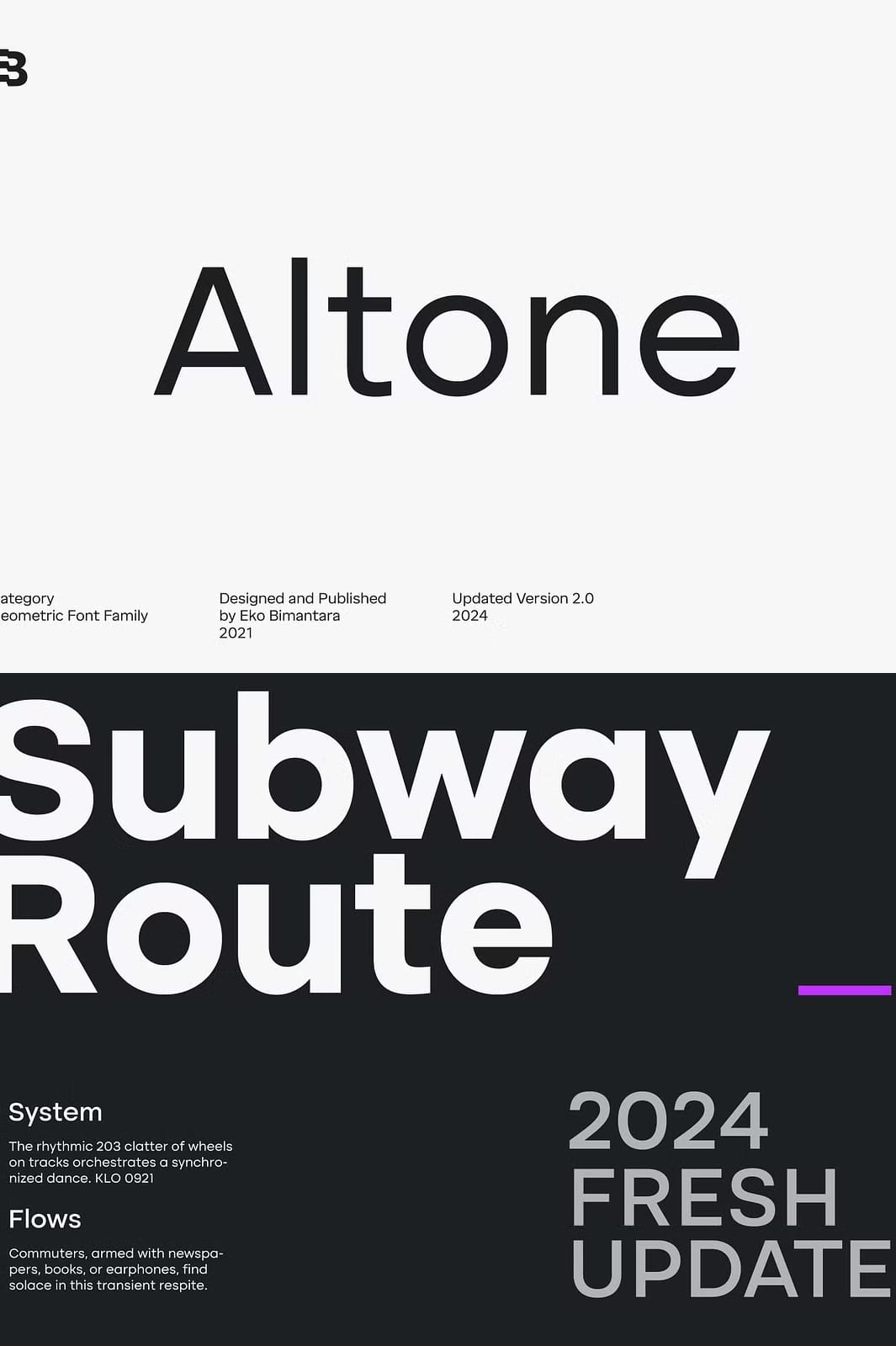
Introducing Altone’s Bold and Regular Design
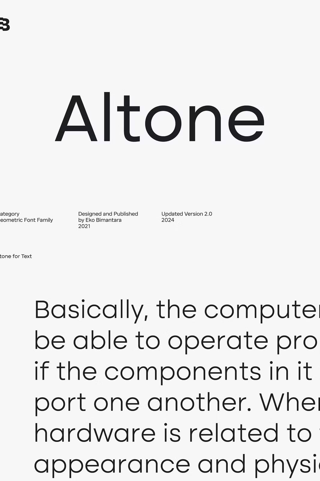
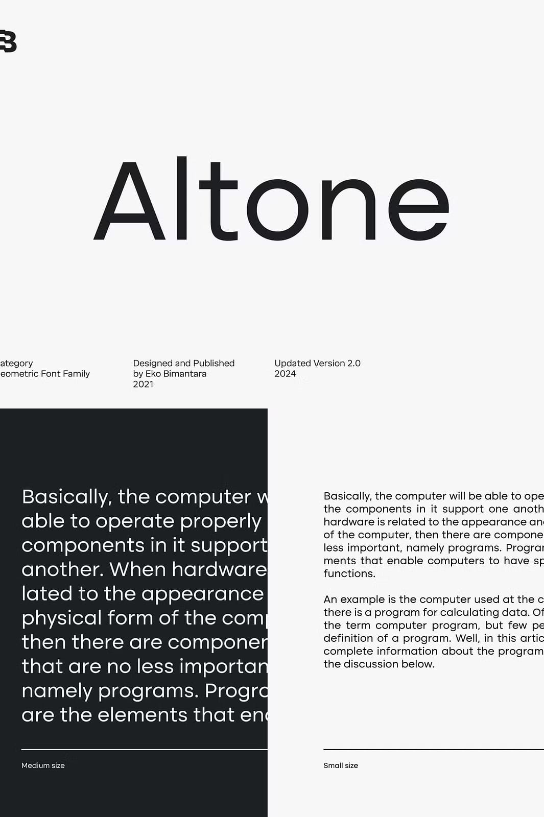
Altone is a modern geometric sans serif font meticulously crafted to embody regularity and clarity. This typeface leans towards a Grotesk style, characterized by its balanced proportions and moderate width to ensure easy readability. Designed with a closed aperture and flat apex, Altone displays a bold personality that stands out in any visual context. Its strong, simple letterforms offer a professional and timeless appeal suitable for a broad spectrum of design uses.
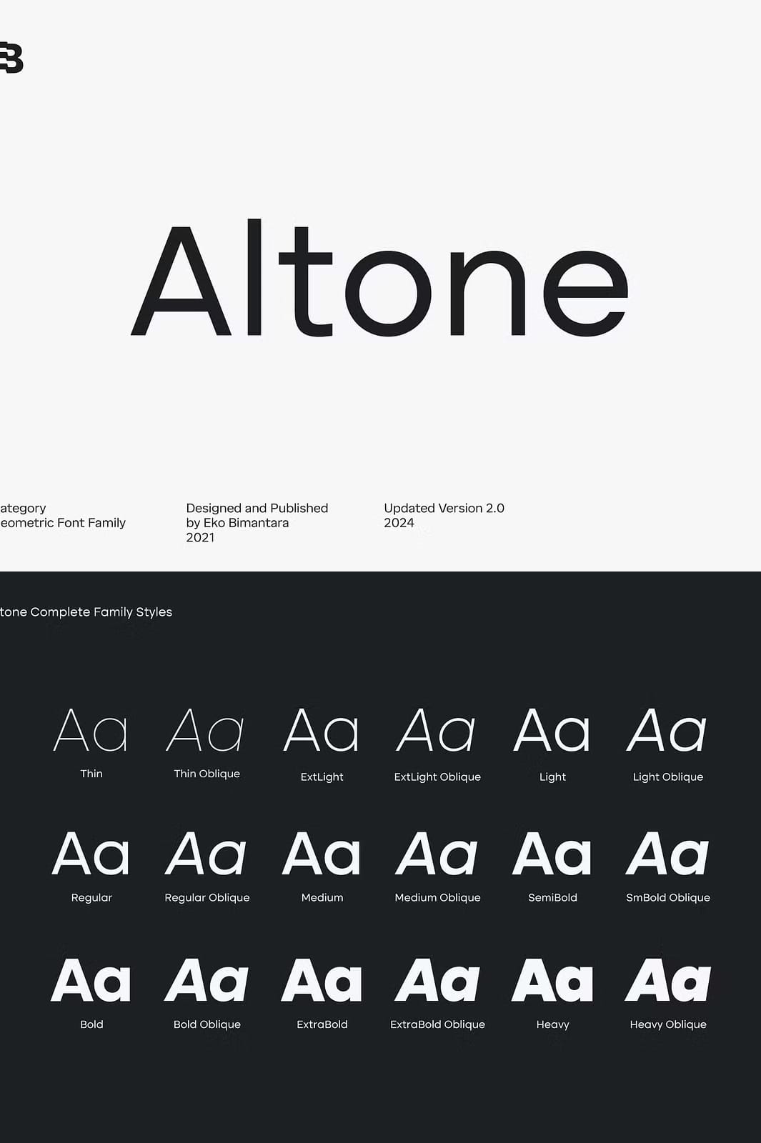
Nine Weights With Matching Obliques for Flexibility
The Altone font family includes nine distinct weights, ranging from Thin to Heavy, each paired with matching obliques. This wide variety empowers designers to create dynamic and cohesive visual hierarchies within a single project. Whether you need subtle light text or a commanding heavy headline, Altone accommodates all demands seamlessly. This versatility enhances its application across branding, editorial design, and digital media.
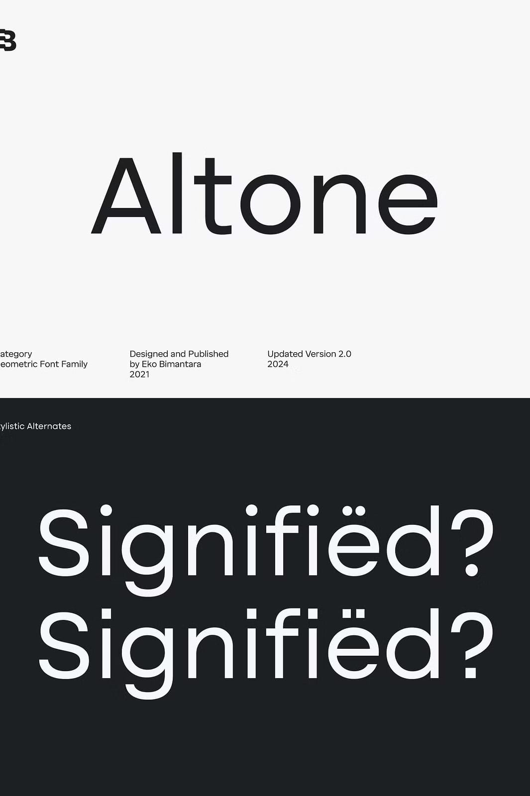
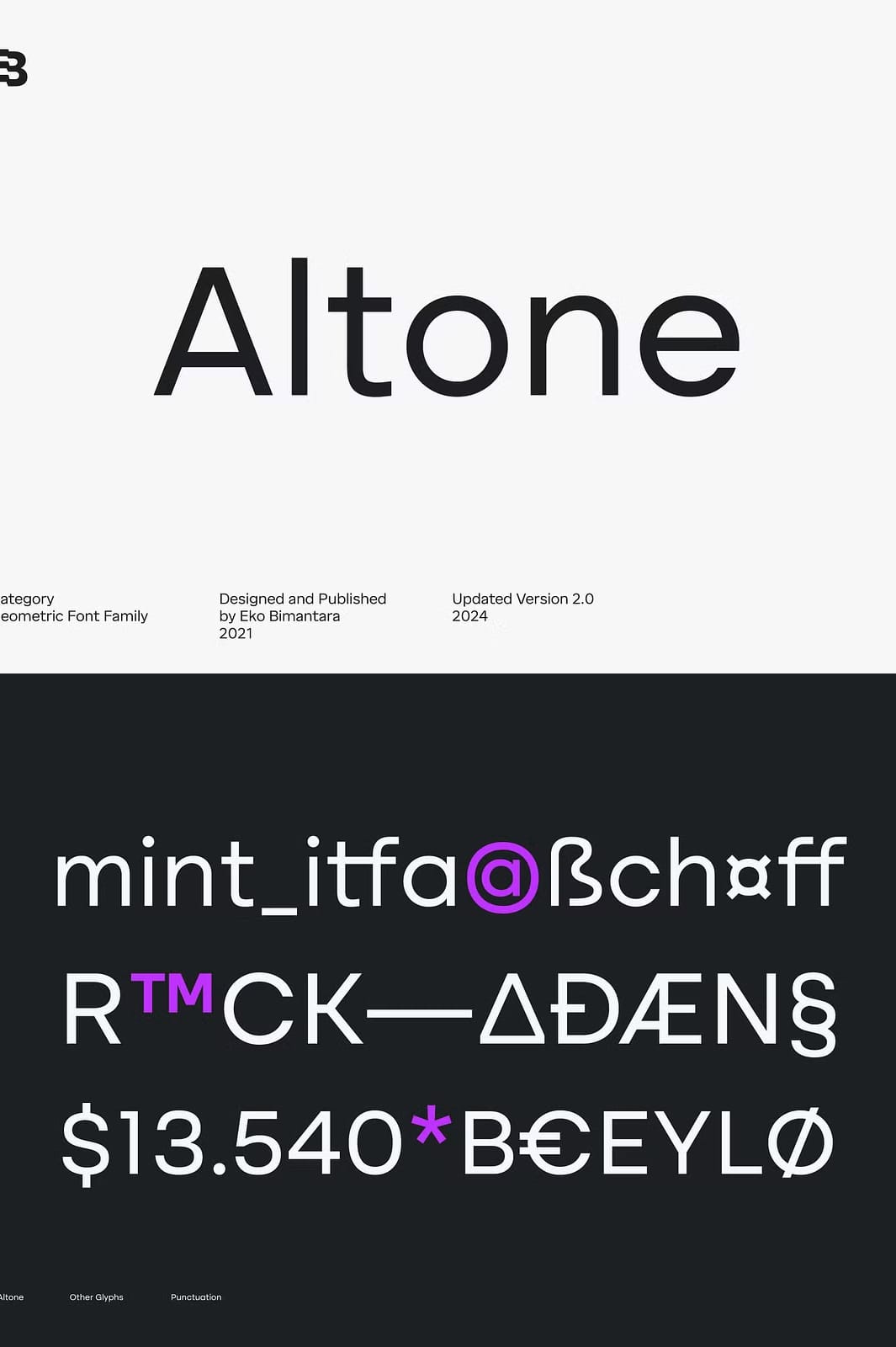
Advanced OpenType Features for Typography Excellence
Altone goes beyond basic font offerings by integrating multiple OpenType features. Stylistic alternates allow customization of letter appearances for unique branding touches. The font also includes varied figures like fractions, tabular lining, numerators, and denominators, increasing flexibility in numeric presentations. These advanced features support professional typographic needs, helping elevate the quality and precision of your layouts.
Extensive Language Support for Global Reach
The font supports a wide range of Latin-based languages, making it ideal for international projects. This broad language coverage guarantees consistent typographic quality and style across different languages and markets. Designers can confidently deploy Altone for multilingual content without concern for character or diacritic limitations. This global adaptability adds to Altone’s professional and functional excellence.
Variable Fonts Enhance Design Adaptability
Altone also offers variable font versions in two styles: Upright and Oblique. These variable fonts allow smooth transitions between weights, providing designers with precise control over font weight and style. This functionality reduces the need for multiple font files and improves workflow efficiency, particularly in web and interactive design environments. Variable fonts make Altone a future-proof choice for modern digital typography.
Appropriate Licensing for Creative Usage
Before using Altone in your projects, be aware of licensing terms to ensure proper legal use. The font typically comes with licenses tailored for desktop applications, supporting logo creation, marketing materials, and other static designs. However, it usually does not permit embedding in web apps or customizable online templates without additional licenses. Reading and adhering to license agreements will help maximize Altone’s value while respecting intellectual property rights.
Why Choose Altone for Your Next Typography Project
Altone stands out as a reliable and adaptable geometric sans serif font family. Its blend of simplicity, bold structure, extensive weights, and rich OpenType features equips designers with powerful tools to create professional, cohesive, and visually striking designs. Whether your project targets print or digital media, Altone can meet sophisticated typographic demands with ease and elegance.