Credit Card Font: A Guide to Choosing the Right Typeface
Choosing the right typeface for your credit card design is crucial in creating a professional and trustworthy brand image. The font you select can convey different messages and emotions, and even impact the readability of important information on the card. In this article, we will guide you through the different types of fonts and how to choose the best one for your credit card.

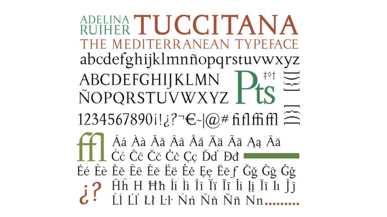
Serif Fonts
Serif fonts have small lines or strokes at the end of each letter, giving them a more traditional and formal look. These fonts are often used in print media, such as newspapers, books, and magazines. However, they may not be the best choice for credit card design as they can appear dated or old-fashioned. They also tend to be less legible in small sizes, which may be a problem when you need to fit a lot of information on a small card.
Sans-Serif Fonts
Sans-serif fonts, on the other hand, do not have the small lines or strokes at the end of each letter, creating a cleaner and more modern look. They are widely used in digital media, such as websites, apps, and interfaces, as they are easier to read on screens. For credit card design, sans-serif fonts are a safe and popular choice as they are legible even in small sizes and convey a sense of simplicity and sophistication.
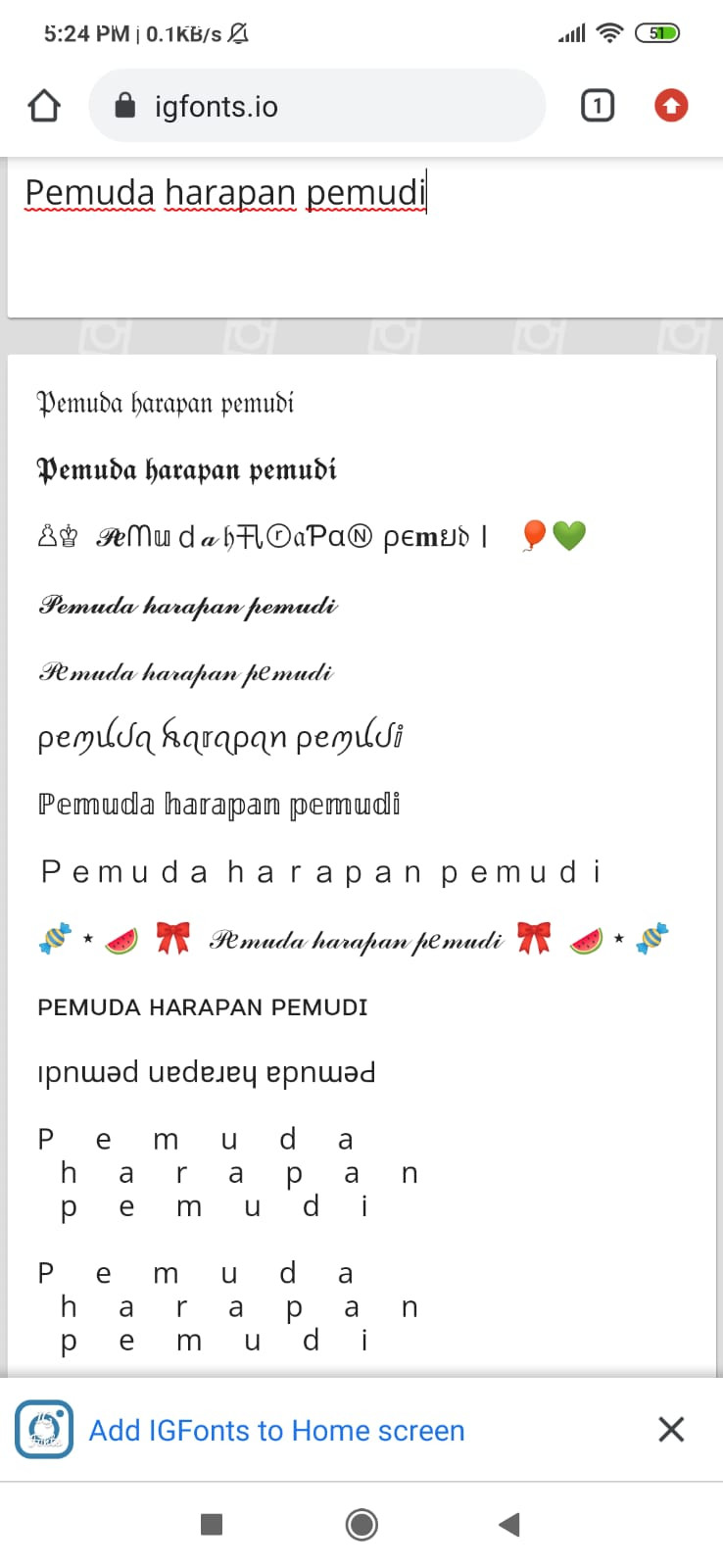
Script Fonts
Script fonts mimic handwriting and often have a cursive or calligraphic style. They can add a personal touch to a credit card design and convey elegance and luxury. However, script fonts can be challenging to read, especially in small sizes or when used for important information such as the cardholder’s name or the card number. They are best used for decorative or branding purposes rather than functional ones.
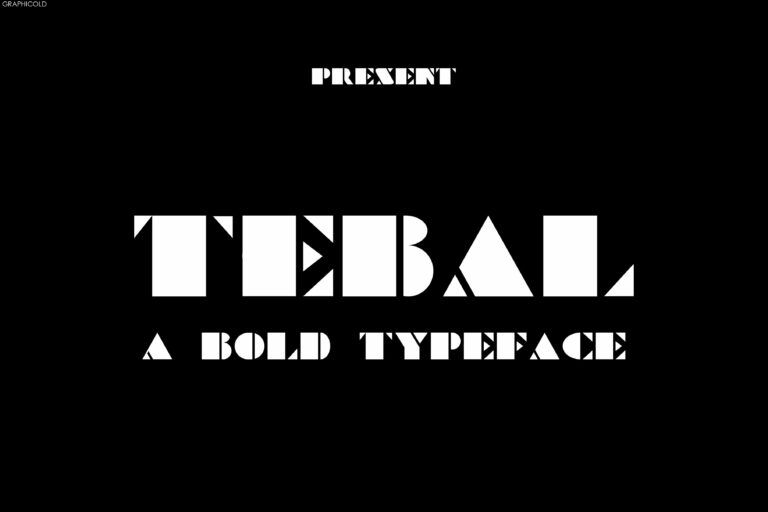
Display Fonts
Display fonts are attention-grabbing and often used for headlines, titles, or logos. They come in a variety of styles, from bold and funky to elegant and sophisticated. While they can add personality and uniqueness to your credit card design, they should be used sparingly and in combination with more legible fonts. Display fonts are not designed for extended reading, and their use can quickly become overwhelming and distracting.
Conclusion
In summary, choosing the right font for your credit card design depends on several factors such as readability, brand image, and target audience. Sans-serif fonts are a safe and functional choice, while script and display fonts can add personality and style to your design, but should be used carefully. Ultimately, the font you select should reflect your brand’s values and convey a clear message to your customers.


