different fonts for the letter s
Fonts play a crucial role in graphic design and typography, as they set the tone and style of a message or text. One of the most important letters in any font is the letter S, which can vary greatly from font to font. Here are some of the different fonts for the letter S and what they convey:

1. Serif Fonts
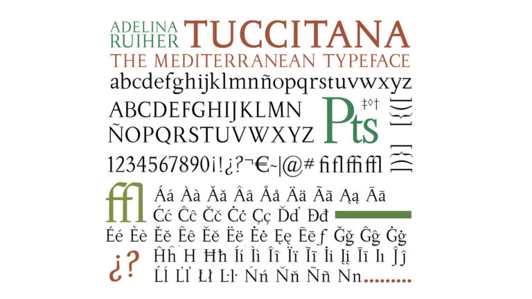
Serif fonts have small lines or curves at the end of each letter stroke, and they are often used in more traditional or formal designs. The letter S in serif fonts often has a curved shape, with the top of the S being thicker than the bottom.
2. Sans-serif Fonts
Sans-serif fonts don’t have the small lines or curves at the end of each stroke, and they are often used in more modern or minimalist designs. The letter S in sans-serif fonts often has a more angular shape, with the top and bottom of the S being roughly the same thickness.
3. Script Fonts
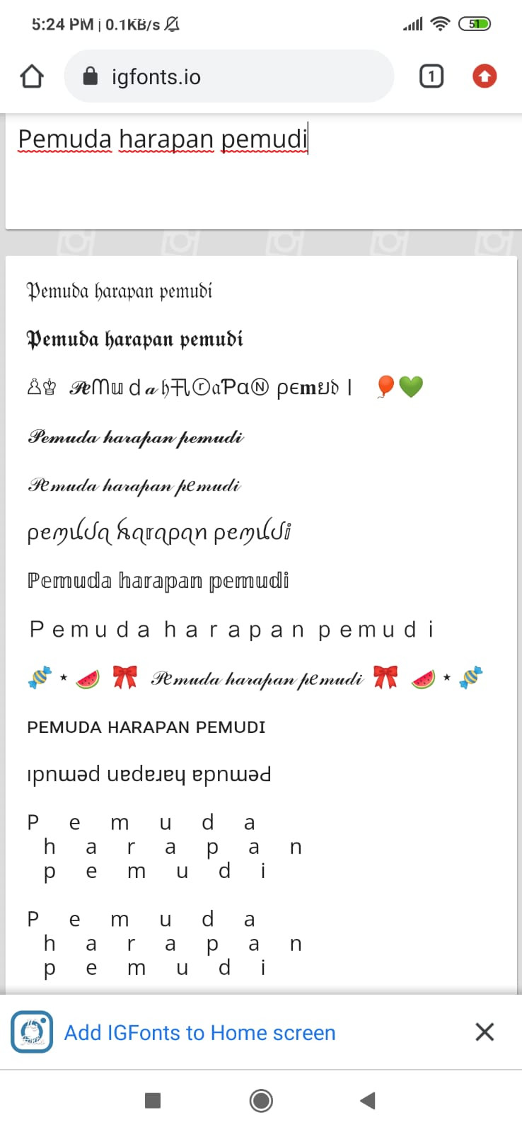
Script fonts are designed to look like handwriting, and they are often used in more elegant or decorative designs. The letter S in script fonts often has a flowing shape, with the top of the S being more curved than the bottom.
4. Display Fonts
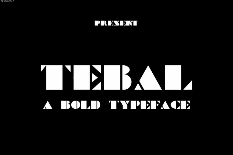
Display fonts are designed to be used in larger sizes, such as for headlines or titles, and they often have unique and eye-catching designs. The letter S in display fonts can vary greatly, from being very angular and geometric to being very flowing and decorative.
5. Handwritten Fonts
Handwritten fonts are meant to look like actual handwriting, and they are often used in more informal or personal designs. The letter S in handwritten fonts can vary greatly depending on the style of the font, with some having a more rounded shape and others having a more angular shape.
In conclusion, the letter S can vary greatly depending on the font used, and each font conveys a different style and tone. When choosing a font for your design, it’s important to consider what message you want to convey and what style will best suit your needs.


